

![How to Create a Killer (Credit Union) Website [Inbound17 LIVE BLOG]](https://www.figrow.com/hs-fs/hubfs/IMG_1081.jpg?width=950&name=IMG_1081.jpg)

Don't Miss An Episode, Subscribe Now
So today I'm sharing my notes with you in this LIVE BLOG from an amazing annual event in Boston, put on by HubSpot -- Inbound 2017!

These tips are adapted from the presentation by Carina Duffy, of Impact Branding & Design (HubSpot's Agency Partner of the Year 2017).
Carina's session was titled "10 Things We've Learned From Doing Over a Hundred Website Throwdowns." Now when Impact does a 'Throwdown' it's basically just the equivalent of picking apart your website for the biggest problems or mistakes and giving your tips for improvement. We actually did one with them last year and found it very useful.
So here's some of her tips that would help your credit union website improve immediately:
FIRST: There is NO Website Formula
There's no X + Y = Z and you'll succeed with your website.
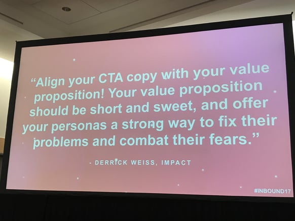
1. Copy: Your Website Isn't About YOU!!
Imagine that you're on a first date, and your date only talks about themselves. They never once engage with you. Well... we do that on our websites all the time.
But wait... you might say "but my website IS about me (my credit union)." Ok, but you need to communicate that from the perspective of who you're trying to help, so start with your Value Propositions and your CTAs (Calls to Action).
2. Talk TO Your People (Credit Union Members)!!
Speak to your personas and their pain points, but also PHYSICALLY, talk to your members! Ask your credit union members what value your business provides to them. What is it like working with your CU? Why do they stay with your institution and not change to a bank? You will very likely find some content you can use on your website!
"Trying to write for everyone is going to suck every time." - Joanna Weibe
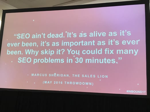
3. SEO Isn't Dead
It's alive and well, so it's essential that you address on-page SEO on every page of your credit union website, and you also need to align this effort with searchable keywords that your target is looking for online.
4. Make Sure Form Fields Match the Value of the Offer
Remember not to ask for too much information when you're just trying to capture your initial leads. Often a name and email is a great place to begin with your landing page forms. And a 'subscribe to email' form is a 'NO' offer! You can do better than this.
Show the value of your offer in order to get people to give you their contact details. Quality content will help you grow your list and nurture leads down their buyer's journey.
5. Just TEST It!!!
We talk about testing a lot, but do we REALLY do it?? There's often a lack of execution on testing.
"Don't just make the change, test the variation." - Tara Robertson
There's a ton of tools for website testing, but whatever you do, you have to start somewhere. HotJar is a great option. There's also online user testing options for website use assessments. But don't just guess, test!
6. Find a Way to Take Your OWN (DAMN) Pictures!!
This isn't to say that you should never use stock photos, but we all know when we see one, especially the really obvious versions. You know them, and so do your credit union members. Using real photos of your real team members will be MUCH more powerful to motivating members to take an action.
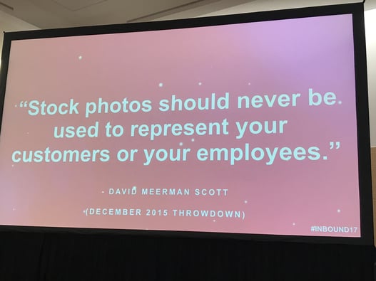
Please help us work together to stop this stock photo epidemic!
RELATED POST: Is Your CU Website Really ADA Compliant?
7. Think About Mobile!!
How will your CTAs look on mobile? Or other images, do they scale down in a manner that still makes them powerful? Small issues on websites will erode trust of users. This is very true of mobile website performance. You need to test your site on all devices and make sure your site is scaling appropraitely, readable and easy to understand.
And don't forget mobile speed performance. Google mobile speed is a great way to assess this and then send the results to your website developer.
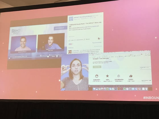
8. You Can't Keep Avoiding Video!
With video there's been a huge barrier to entry. To stay relevant to your credit union members you're going to have to create videos and use them regularly. But there's SO many ways to get into this game.
Consider Facebook Live, Instagram Live, or even product demos with SoapBox. Start somewhere, and start NOW!
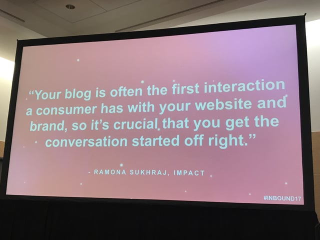
9. You Credit Union Blog is Many People's First Impression of You
Imagine if you're inviting people over for dinner and you spend time cleaning the entire house and your yard is a mess, your dog pooped on the sidewalk... that's what it's like when you get to a bad blog on an amazing website. Don't do it!!
10. Don't Take the User Journey for Granted
You need to get your credit union's valuable content out there and then help your user easily navigate to find it. Make sure it's easy to move around from one valuable piece of content to another on your website.
You should also consider one-on-one user testing of your website. When you watch this you'll have so much more insight into what is working and what is not.
Related Post: Why Using Scanning Tools for ADA Website Compliance Isn't a Great Idea

.jpg?height=500&name=File%20(6).jpg)


Blog comments