


Don't Miss An Episode, Subscribe Now
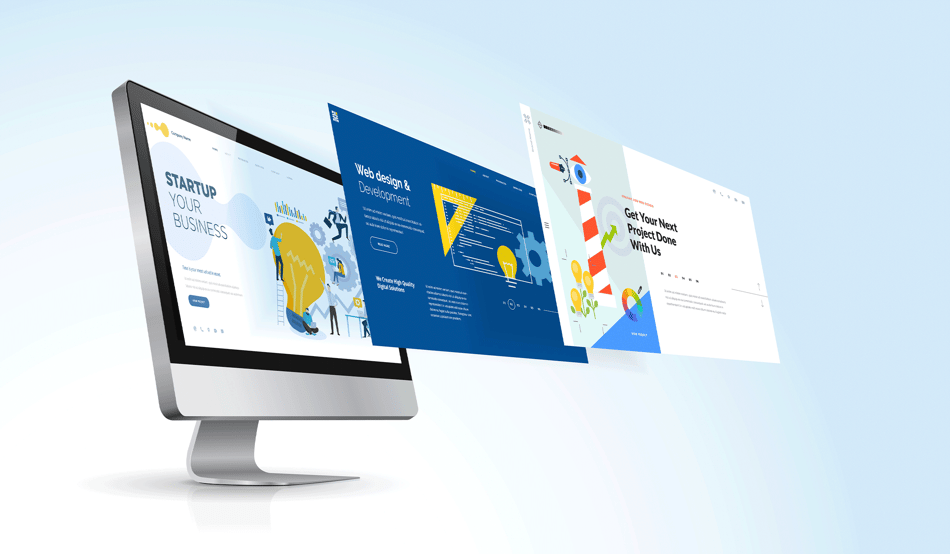
Your bank or credit union's website needs to have a cutting edge design in order to accomplish not only sales and conversions, but to have a successful digital branch. Your digital branch is your largest branch. More people are going to see that every day than they are walking into your physical brick and mortar. We discuss the key priorities your website must focus on!


Transcription:
Have you ever been talking about something that's really useful and thought that's a great idea? Let's hit record so we can share this with everyone. If you're looking for best practices for your bank or credit union, join us while we talk all things, sales, marketing, and strategy for financial institutions. Let's make it happen with FI GROW Solutions.
Meredith Olmstead:
Hi, there I am Meredith Olmstead, CEO and founder of FI GROW Solutions. We are a digital marketing and sales consulting agency, and we work exclusively with financial institutions. We do mostly inbound marketing for our clients, but we also do websites, design, development, and launch, content and launch. We're having a really interesting conversation. I was just talking with Penne Vanderbush our chief of strategy. Say, hi Penne.
Penne Vanderbush:
Hey there.
Meredith Olmstead:
So we're working on a couple of different website projects for clients right now, and we were having kind of a back and forth on how cutting edge the design or the concepts around the design of these websites really need to be in order to achieve what we're trying to achieve for our clients. And so Penne and I were like, let's push record on this because this is obviously a topic that is people get a little passionate about, but also it's super important for executives and for marketers to really think all the way through because all bank and credit unions need really solid digital branches in the form of a really good website that does a lot of things. And so we wanted to talk about it a little bit.
Meredith Olmstead:
So is cutting edge design really something that should be a priority. I'm curious, Penne, where do you stand on this topic?
Penne Vanderbush:
Yeah, so obviously it's incredibly important. You don't want a digital branch that's supposed to be representing your brand. So your digital branch, first of all, is your largest branch. More people are going to see that every day than they are walking into your physical brick and mortar. So of course you want it welcoming, you want it aesthetically pleasing. However, when we work through designs there's also some people on the team who want the most amazing design that they've ever seen in a website, not just for a financial website but just websites in general. So we run into a lot of things like where does that design fall on the priority level? And for me personally, I don't think it's at the top of the list. The website has to work, it has to drive bottom line results. They're not cheap to build, they're less expensive than a new physical location, obviously. But for us the priority, isn't always the design. While it is important, it's not the top of the list.
Penne Vanderbush:
So, and I think some things kind of get into that too, when you get into like ADA compliance, we recently were in a design process where one of someone's brand colors, this credit union's brand color, the contrast wasn't where it needed to be for ADA compliance, and so it couldn't be used. We had to create like a variation of that color. So sometimes you even have to go a little bit off brand for reasons like ADA or for functionality. It can't always be in alignment with every design piece that you have. Design is also incredibly subjective. What are your thoughts?
Meredith Olmstead:
What one person really likes another person could really hate. The tricky thing about that is when you're in the building stage or in the concepting stage of something it's hard to put a finger on what one design is going to have better results than another design, if you're really looking at just the aesthetics of the design. The other thing that we were talking about is the difference between design on desktop versus design on mobile. We are always putting the mobile experience front and center in our conversations around what features and functionality have to be on a new site. And that's because most websites have 55 or 60% of their traffic coming in on a mobile device. So it's really important to take that into consideration.
Meredith Olmstead:
So, definitely making sure that you recognize that while one design might really pop and be amazing on your desktop, it may translate 100% in the other direction when you're looking at it on mobile.
Penne Vanderbush:
Yeah. Well, we've seen that with things like comparison tables or some elements. So we have some kind of module elements that when we design that we call it like pushing, like it pushes into the one above or into the one below. And what that does is it stops like that clean line between everything from being so rigid as you're scrolling. But once you get on mobile, it is a scroll experience and those elements don't always push above or push below, or those comparison tables now turn into like left to right sliders, they don't look like they did on desktop. And so a lot of the times we'll hear a lot of focus on what that desktop site looks like. We know the majority of the traffic coming to that desktop site is immediately heading to online banking. So we already know a high percentage of people using that desktop, they're just trying to get to their accounts and they're probably not navigating as many pages. That's the highest volume.
Penne Vanderbush:
So, spending a ton of time on what that service landing page looks like, that gets a small percentage of your traffic and exactly what that aesthetically looks like on that page, which will look completely different on mobile, where most people are going to see it anyway. We don't want to see that stalling the project. We don't want to see that slowing down or at the end of the project when the designs are done and developments being done, which typically happens with a smaller team, might be the marketing department and a few others. And then typically it's presented to a larger executive team or other people before it moves out into all of the employees and certainly before publishing. And then sometimes you start to hear that feedback, like later in the game where it's like, oh, it doesn't pop well enough or it's not exciting enough, or it's not cutting edge enough.
Penne Vanderbush:
For you Meredith, how do you approach this as a marketer where like this could be coming and that could be the feedback that you get. So what do we do in the beginning of the project or how do we mitigate this so that the new design doesn't roll out and half of the staff are like, I don't like it?
Meredith Olmstead:
We have some thoughts about that. Before I jump into that though, I just want to say so really from a priority perspective for banks and credit union websites, while the aesthetic of it and the design of it is obviously important, it needs to be pleasing to the eye. We know it's subjective so we know that not everybody's going to agree. So what it really needs to do is it needs to be trustworthy, so it needs to appear trustworthy. It needs to have easy access to accounts, your login buttons need to follow you around on your mobile and your desktop experience. There needs to be a clear user journey. So we like to have one clear call to action, like this is the success on this page, this is what we want a user to do. And that call to action should follow that user around, even if the page scrolls down. So if your call to action is apply now, you're applying now button should appear in multiple places as you're scrolling to really have a very easy to navigate user journey through your different pages on that digital branch.
Meredith Olmstead:
It needs to have domain authority. It needs to have a decent amount of content on it because you've got to have content that talks to your products and services with keywords and good quality, trustworthy advice and information in order to be found in search, it should be fairly concise and easy to consume. You don't want lots of distractions on your eye when you're on the page. And you got to capture leads. So those are the main things that we're really looking for. And then the aesthetics comes in that list somewhere towards the bottom of it.
Meredith Olmstead:
But what should you do? We were just talking, we have a new project we're about to be launching. You and I were just talking about a great idea that we're going to be working with their little bit larger executive team to try to drive buy-in and get some design inspiration at the same time. So what we recommend to clients is that they go to a larger group of their executive team and say, hey, give me, submit two or three or four websites that you really like. That you like the look of it, the functionality, the user experience, all those different things. And share that with me in like a submission form or an email, but make sure that you explain to me what it is about the website that you really like, and you have to keep it short and sweet. And then we take all of that, kind of digest those tips, and then hand that off to the design team for the design team to really use and kind of take in when they're coming and crafting a look and feel around is some executive thoughts.
Penne Vanderbush:
Yeah. I think with that uncovers, so the first big, how do you do this is first run through that list that Meredith just went through. What are the goals of the website? The trust, the account access, ranking for search, those are the priorities over a design. So making sure that everybody understands that. If people don't feel heard and if they feel left out of the process, they're definitely already going to be defensive about it. So doing this inspiration site to all of the stakeholders who are going to have a final say is a way to let people express their ideas and thoughts and opinions. And you could even uncover during that, if you're the marketer you might be like, wow, I was really trying to stick solid to our brand that we've had for so many years... We definitely see a lot of people coming into a website design process with a brand that hasn't been touched in several years, a decade or more sometimes. And through that inspiration process you might even like uncover, wow, we might need to consider a rebrand or a brand refresh as part of this before we invest all this time and money into this incredibly large digital branch. It might come to the surface that everyone's kind of itching for a little bit of a brand refresh and maybe that should be addressed-
Meredith Olmstead:
They're open to a little more modern approach. They want things maybe a little more streamlined. Maybe people are leaning towards white space versus color. There's a lot of different approaches to website design. So I think it is great. If you can give some of the stakeholders a voice at the beginning of the project, that's great. What I will say about it is you want to be super, super careful about how much more input that larger team has to the process. Because when you open a design process up to lots and lots of feedback while it's going on, it will bog down the feedback loops, it will slow down the timeframe for the project. It will provide like situations where you have to say, all right, look, we need consent, not consensus. Like not everybody has to agree. You're going to have people who feel like their design ideas were kicked to the side.
Meredith Olmstead:
So, you do want to make sure that at the end of the day, your professional marketers and trained marketers, your designers, your website traffic experts and content experts are the ones who are making the final decisions for what the website and the aesthetics, the direction it's going in.
Penne Vanderbush:
Absolutely. And I think that's key right there, is you're looking for consent, not consensus and being very clear about that at the beginning of the project. Say, hey, there's 10 of us in this room. All 10 of us will not have the same opinion. We're all going to think something looks different. We're going to like certain designs or dislike certain designs because it is so subjected. So at the beginning of the process, everyone will have an opportunity to submit some inspiration. From that the experts, the marketers, the design team, the developers are going to take all of that feedback, align it with our brand, with all of these characteristics, the website has to have the lead generation, the account access, the building trust, customer journeys, all of that, and ADA compliance. And we're going to have to fit all of this into those things, which are more important and have to be done correctly. Then when we are done with that, we are asking for your consent to accept it as final right and move forward. We are not looking for consensus that everyone agrees that it looks just perfect.
Meredith Olmstead:
Right. Absolutely. Awesome. All right. Lots here to digest. Thank you so much for sharing your thoughts. I think this is a really important episode for people who are heading towards a website or digital branch project.
Penne Vanderbush:
Yeah. Absolutely.
Meredith Olmstead:
Really important to plan ahead for these kinds of scenarios conversations. So, you guys please come and visit our website. We have a lot of great information on how to build digital, as well our academy there for some additional training and lots of other great podcast episodes. And in the meantime, let's just all get out there and make it happen.

Blog comments