
- FI Type
- Credit Union
- Location
- Phoenix, Arizona, U.S.
- Objective
- Name change and rebrand.
- Website
- www.copperstatecu.org
Results
-

-
1 New Name & Brand
Merger success!
-

-
$600 M
In combined assets.
-

-
42,000
Members strong.
The Challenge
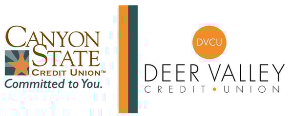
Following a successful merger in October 2019, Canyon State Credit Union and Deer Valley Credit Union were in search of a unified brand and a new name that represented their new, stronger, larger credit union.
The Goal
- Define their new identity as a larger organization.
- Determine the best new name for the credit union.
- Explore, define, and align their core values.
- Create a strong brand that's relatable to current and potential members.
- Create a new brand book.
- Deploy a successful brand and name launch strategy.
The Result
The newly defined brand for Copper State Credit Union has rich core values (Family, Empowerment, Discovery, Excitement), the perfect blend of the highly sought-after youthful and professional presence, and an unwavering commitment to elevate and strengthen Arizona families through financial empowerment.
"It was a great experience to work with the FIGROW Solutions team for our rebranding initiative. Their creativity, knowledge of credit union culture and attention to detail made this project a success for our members and staff. The rebrand has directly contributed to achieving our measures of success as an organization and our bottom line."
- Robb Scott, President/CEO
Rename and Rebrand Case Study
FI GROW Solutions had been partnered with Deer Valley Credit Union for two years prior to the merger with Canyon State Credit Union. When the opportunity for a merger of equals presented itself, both credit unions were excited to move forward and embraced the change.
FI GROW helped the credit unions plan a communication strategy and work through the merger correspondence. It became apparent rather early in the plan that redefining the brand and consideration of a new name was needed.
The New Name
There was a valid concern that keeping either of the two credit union names could be perceived by members as "pulling the wool over their eyes." The merger had been positioned as, and truly was, a merger of equals. It doesn't feel equal if the credit union keeps one name over the other.
Our CEO and Founder Meredith Olmstead and Chief of Strategy Penne VanderBush went on-site with the executive teams of both credit unions for two days to explore and define brand attributes, core values, and cultural strengths.
In reviewing the results one thing was glaringly obvious. There wasn't much about their core values that needed to change (probably a major reason the merger made so much sense for the two institutions). The values simply needed to be further defined and clarified. While this is a fantastic result to have, it also meant there wasn't going to be a dramatic overhaul to the culture, feel, and community impact that would lead to an obvious choice for a new name.
How The New Name Was Decided
The idea for the name Copper State Credit Union wasn't a novel idea, Arizona is in fact 'the copper state'. The name had been mentioned by staff members, Board members, and even us at FGS as a possibility. But it wasn't until we really dove into the concept that it became clear it was the right choice. It was the relevance for which copper as an element so accurately described the credit union and its culture that made it the perfect fit.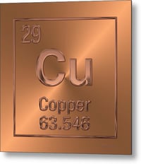 First, there was the irony (no metal pun intended) of the element itself - Copper is the 29th element on the periodic table of elements and its symbol is "Cu".
- Copper conducts electricity for power - the credit union desired to be the conductor of financial knowledge and knowledge is power.
- Copper is corrosion resistant - just like their strong cultures and values that were still prevalent and strong through the merger, they won't corrode.
- Copper can be easily joined together with more copper - as the credit unions were through the merger.
- Copper is a tough metal - it symbolizes strength and stability which prevails in the new structure of the credit union.
- Copper is malleable, workable, and doesn't lose strength when reworked - it's agile and strong through change and stands the test of time just like the credit union.
- Copper is bold - Thick copper strips are used on church steeples as lightning conductors to provide protection. The credit union wanted to be viewed as bold in both its brand presence and in its promise to provide financial safety.
From so many angles the name made sense as it represents what the credit union stands for while embracing the concepts and ideas on which their belief system is built.
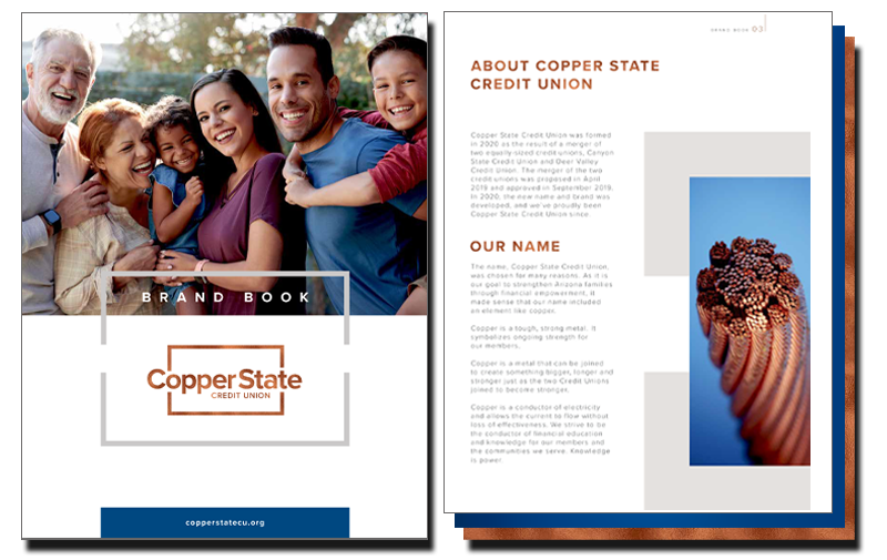
Brand Book:
Included: Core Values, Value Statement, Visual Identity, Logo Specifications and Usage,
Brand Color Palette, Typography, and Content Style Guide
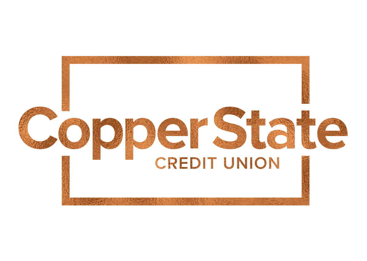
The Logo
The design of the logo incorporates the symbolic meaning of the brand perfectly. The logo symbolizes strength. The heavy font style conveys strength, stability, and quality. The copper brackets visually demonstrate that the credit union is inclusive and protects the realm in which its members thrive.
The name extends beyond the brackets to symbolize their positive outreach into their communities, while “credit union” stays inside the brackets, titling the space that represents their cooperative home.
While the logo uses just one color choice, "copper foil" as it's referred to, they display 'Copper State Blue' prominently in many places. The color blue is associated with confidence, dignity, loyalty, success, security, and trustworthiness.
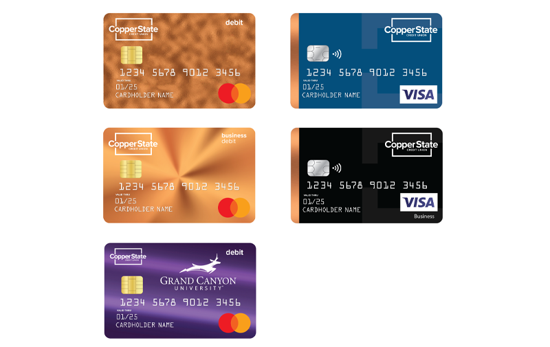
Use of Logo, Styles, and Brand Colors on New Cards:
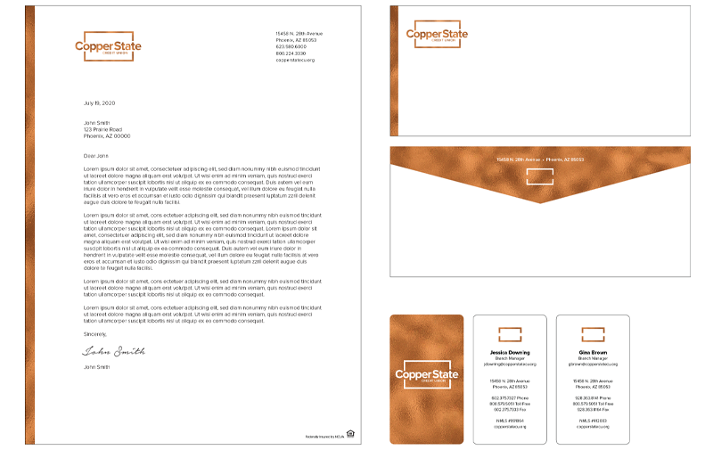
Use of Logo on Stationary:
Value Statements
The Copper State Credit Union value statements came together organically. Throughout the process of defining the core values, the value statements began forming. Once complete, they accurately captured the purpose of the credit union and so purposefully illustrate the 'why' behind the amazing things their employees do to help and support Arizona families.
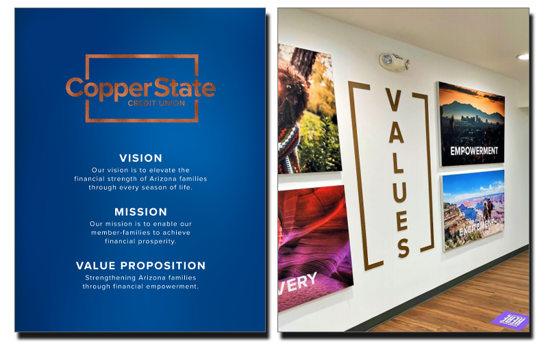
Vision
Our vision is to elevate the financial strength of Arizona families through every season of life.
Mission
Our mission is to enable our member-families to achieve financial prosperity.
Value Proposition
Strengthening Arizona families through financial empowerment.
The Copper State Credit Union brand book summarizes these value statements with this belief statement:
"We believe that financial strength through financial empowerment leads to financial prosperity."
"We use our value statements almost daily at Copper State CU. They drive our decision-making and act as a guiding light for the direction of the credit union. When we move forward with initiatives that align with our values, we know we're moving in the right direction."
-Jenn Wade, CMO
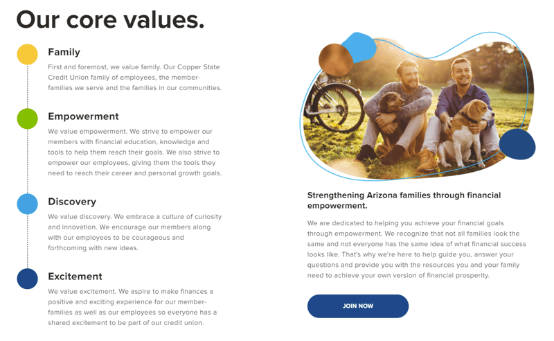
Core Values
Narrowing core values to just a few can be a challenge. It's difficult to decide which values make the final cut when they are all so important to daily operations and service. For Copper State CU, we worked to find the values that most accurately encompassed the traits and feelings of their new brand.
Family
Copper State CU has fully embraced the true meaning of family which looks different for most people through different seasons of life. This includes those who are related through traditional family ties and those who are not. Throughout their website and other collateral, you'll see that through the use of imagery and language they've tried to be all-inclusive of what families can look like today.
Empowerment
Empowering Arizonians is something Copper State CU is passionate about. They have built a robust financial education resource center on their new website and are dedicated to providing financial education through the use of blogs, eBooks, webinars, social media live streams, on-site visits to schools and employers, and wherever else the community might be looking for financial information and education.
Discovery
Copper State CU embraces a culture of discovery and invites new ideas, collaboration, and feedback from both employees and members to help improve the credit union. This means they're also okay with 'failing forward.' They're willing to try new things and learn from them. All employees are welcome to participate in the forward movement of the credit union without fear.
Excitement
While it may feel like finances can't be exciting, financial prosperity is very exciting. They recognize that it powers hopes and dreams for their member-families and brings them significant moments of joy and excitement. Copper State CU is committed to highlighting that excitement through its product offerings, messaging, member benefits, and more.
Brand Values Tansparently Described on the Website:
Creation and Integration of Brand Values through Employee Posters and Lobby Design:
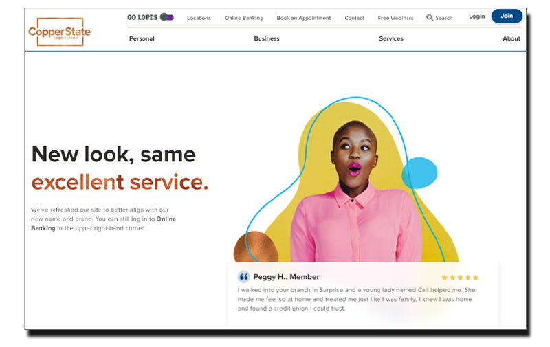
Digital Branch
We brought the new name and brand online with a new Digital Branch. Each credit union had its own website on different platforms prior to the merger. Their new Digital Branch was built on the HubSpot platform and brought the new brand to life in the digital space.
"This Digital Branch build was truly refreshing!" stated FI GROW Chief of Strategy Penne VanderBush, "Copper State CU truly embraced a modern, younger feel, and bringing it to life online was a refreshing change of pace. We love how their brand identity and brand voice are implemented on their Digital Branch to clearly demonstrate how their values are embedded in everything they do."
[visit the Copper State Credit Union Digital Branch here.]
Launch of a New Digital Branch:

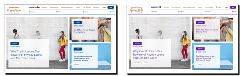
One unique feature of the new Digital Branch was the inclusion of the credit union's partnership with Grand Canyon University. While the partnership didn't influence the name change or rebrand, it was Copper State CU's commitment to including them in the new Digital Branch that magnified the implementation of two of their core values even further.
The values of Family and Excitement are fully embraced on the new Digital Branch as any student, faculty, alumni, or fan of GCU can use the "GO LOPES" toggle located in the header to turn the header text and CTAs on the site GCU purple! This element creates a sense of importance, belonging, and exclusivity for anyone who considers themselves part of the GCU and Copper State CU family and provides an exciting characteristic to the site that gives the visitor control of their experience. It's a simple, and cool way to bring two of their core values to life for an important segment of their membership base.
In Conclusion
The Copper State Credit Union name change and rebrand was a phenomenal success for the two merging institutions. The newly defined core values have been the catalyst for many new initiatives, such as a financial literacy commitment including monthly live webinars because the credit union can now measure their efforts not only by revenue generated but by how these efforts support their commitment to fulfilling their brand promise and upholding their brand values.
FI GROW Solutions was honored to have been chosen for this major initiative for the credit union and we're incredibly happy with the results. The Copper State Credit Union team was amazing to work with and their knowledge, experience, and tremendous passion for the credit union and its members were evident every step of the way. We're proud to be their partner agency.
A merger, can be an opportune time for a name change and/or rebrand but it's not the only time to consider it. If you've had the same look and feel, the same messaging, and the same marketplace presence for years and it's yielding less than desirable results, it may be time to consider a change like this.
Learn more about how we can help your bank or credit union with similar results! Click below to get in touch.

SHARE THIS CASE STUDY: