


Don't Miss An Episode, Subscribe Now
Building websites is one of the most fun and challenging things we do here at FI GROW Solutions. The lessons we learn from working with different clients, partner agencies, and ever-changing regulatory requirements are endless and sometimes far from ordinary!
If you’re considering a new website any time soon, here are 8 tips based on some of our recent website building experiences to ensure your website build goes smoothly:
1. Never Assume ANYTHING
2. Manage the Number of Images During the Design Phase
3. Create a SEPERATE Plan for Graphics Creation and Management
4. Require Graphic Dimensions From the Development Team
5. Good Project Management Tools Are A MUST
6. Don't Launch Multi-Language Sites at the Same Time
7. Staying ADA Compliant is an Ongoing Task
8. Your RFP is Probably Missing Something REALLY Important
1: Never Assume ANYTHING
Sounds simple enough, but boy is it easy to mess this one up! We just made this mistake ourselves in a recent build.
A member of the development team built one rate table in the backend of the site. Yup, ONE. Editing a rate required scrolling through hundreds of rows to find the right product and term. It seemed ludicrous to us, so why did he build it that way instead of a table for each product?
Well, in the last project he worked on, a different client wanted them all in one. He assumed one table was the right thing to do and we assumed each product would have its own table. That assumption took 2 days to fix by rebuilding the tables!
Another assumption you’ll want to avoid making is assuming that the person/agency you’re working with will be the ones building your site. There are so many white label developers and agencies out there you’ll want to check references carefully and straight-up ask the company responding to your RFP or pitching you on the site if they’re the ones actually doing the work.
There’s nothing wrong with outsourcing the work a level or two. In fact it’s pretty common these days. But the more layers of people involved, the higher your cost will be, so make sure you have a clear understanding of how many people/agencies are participating in your build and what each of their roles are.
2: Manage The Number of Images During the Design Phase
The trendiest of website designs typically include a greater number of graphics. This poses two concerns you should address during the design phase to ensure your final layout makes sense when it's implemented.
First, the more graphics you have the longer it takes the page to load. This can hinder your organic rankings when search engines recognize your page takes longer to load than similar (competitor) pages. You’ll want to address this with the designer and the developer to ensure there’s a plan for compressing images to maintain page load time integrity.
Note: this holds true for excessive use of Java too. Every element on your site that moves carries a page load weight with it.
Second, every one of those images needs to be purchased, created, and loaded to the site with image alt tags for both ADA accessibility and SEO value. It's more work and steps than you're probably imagining. You may decide that it’s just not worth the time or cost to create 4 custom icon graphics next to every bullet point for every product and service page adding 80-100 more graphics to the project, even though it looks fantastic in the design.
Also, make sure you know how many graphics are included in the scope of work and how many you'll need to supply or purchase yourself. Sometimes graphics are not included, or only a set number are included. Don’t assume!

3: Create a SEPARATE Plan for Graphics Creation and Management
Graphics are basically their own project in during a website build. In a recent redesign project, our client approved a design that included nearly 500 images for the site. Hero images, on-page images, icon images... it was a lot!
In another build, the design didn’t require as many graphics, but our client was using an outside graphic designer they already had a working relationship with to create the graphics.
In both builds each image had to be selected, approved, sized/created and then loaded to the site for final approval. This involved 3-5 people and required a separate graphics plan that ran parallel to the website development schedule.

4: Require Graphic Dimensions From The Development Team
When a designer creates the look-and-feel for a site it doesn’t include the exact dimensions of the graphics. The exact pixel width and height are determined when the module is finalized for the site by the developer.
It’s not a common practice for the developer to provide a spec sheet for all graphics after a page template is final. You’ll want to request one so you can make image changes to your site after launch. This spec sheet will also tell you if the image will scale appropriately on all devices based on the width to height ratio.
Note: Communicate that you expect images to scale and not crop on mobile devices. We still see modules out there that are coded to crop images because it’s easier for the developer. Next thing you know you have pixelated icon images skewing across the screen or images that are inappropriately focused on specific areas of the body that could cause problems you just don’t need! 😖
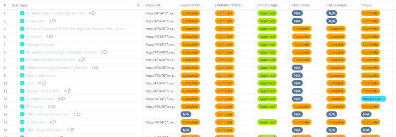
5: Good Project Management Tools Are A MUST
A project management tool should add value. It shouldn’t require a large learning curve that results in lost website production time because the team is trying to figure out how to ask a question, add a comment, or update a status in the tool.
We’ve found in many cases that using different tools to keep everyone on track has been more successful than requiring everyone to stick to one. It sounds counterintuitive but it works!
For example, we typically use one Asana project with our clients (in a list format) and a different Asana project with the development team (in a board format). Each project has different phases for completion, different approval processes, and different people involved in those steps. It’s not logical to put all those people in the same project.
When we worked with a client’s external graphic designer, we created a Google Doc with a table of the images needed, the sizes, links to the approved graphics, and instructions for what we needed. Google Docs was a tool the designer knew and was comfortable with so we put the information in there and linked to it from Asana where we needed it for reference.
Keeping everyone on the same page is the goal. Keeping everyone in the same tool on the same project board isn’t necessarily the best way to accomplish that goal.

6: Don’t Launch Multi-Language Sites At The Same Time
Building a multi-language site is essentially building two sites at once. This isn’t difficult at the development level, but it’s incredibly difficult for content creation.
It’s standard practice to allow your internal staff access to the site prior to a public launch and it’s inevitable that there will be changes to content when they see it. Making edits in your primary language isn’t a problem but if you’re using a third-party translator they likely won’t be able to turn around the edits as quickly as you’d like before your public launch. It's pretty common to have content edits the day before or even the day of launch.
Note: A good translator is worth their weight in gold. We recently learned that there is more than one translation in Spanish for the word “member.” One means your credit union member, the other refers to a male body part! 😲 Don’t make that mistake by trying to cut costs!
We recommend launching the primary language site first, then having it translated for the multi-language variation and launching that a few weeks later.

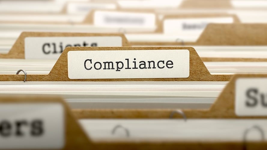
7: Staying ADA Compliant is an Ongoing Task
Launching a site that’s ADA compliant doesn’t mean it’s going to stay ADA compliant. With time, ADA compliance rules will change and employees will start to do things like load images without alt tags and change colors for promotions and programs that don’t meet ADA color contrast requirements, etc.
Make sure you have a plan in place to ensure that your site is ADA compliant going forward. Unless you've agreed to an ongoing support plan for ADA compliance with your web developer, it’s your responsibility.
8: Your RFP is Probably Missing Something REALLY Important
Most RFPs for websites look the same and ask for the same information. The problem is that they’re all missing the same thing, and it’s something very important that you should be including!
Your website is the hub of your digital presence. Everything you do online points to your website. Its job is to function as your largest branch, open 24/7/365. Yet we never receive an RFP to build a Digital Branch, just a website.
What’s the difference? It’s a HUGE difference!
A Digital Branch is a living breathing digital asset that works non-stop to drive revenue growth. It not only produces leads but it self-manages them until it's necessary to get a person involved. It doesn’t just provide informational content, it delivers the right content to the right visitor at the right time using system and behavioral data.
Every touchpoint with your site pages, landing pages, blog posts, and emails is another data point that's extremely relevant to delivering the right message. It's efficient and effective, unlike a regular website.
A website, even a beautifully designed site that looks great on desktop and mobile with a handful of lead capture forms, is nothing more than a Lamborghini missing the engine under the hood if it can’t identify the visitor and provide what they need with dynamic, data-driven smart content and get that lead to sales when the time is right.
On the flip side, building a robust Digital Branch without the right digital advertising strategy for attracting qualified leads, and limited or no marketing and sales team collaboration for handling those leads is like owning a fleet of Lamborghinis with powerful V10's under the hoods and having nobody to drive them.
Despite your current site’s look and feel, how are you sure a new site is the right next step in improving your digital presence? The reality is that building a website simply because the current one is outdated isn’t a practical next step for digital growth. What is a practical next step is a fully comprehensive digital deep dive to see what’s working, what’s not, and what needs to be in place before building a new Digital Branch to ensure you’re positioned for success.
Before blasting a website RFP to a bunch of agencies and vendors, consider a full digital assessment. Maybe a new Digital Branch is the logical next step and exactly what you need, but maybe it’s not.


Blog comments